
Building IWIK from the ground up
Quobis’s marketing team develops use cases to make Sippo’s features shine. After a customer request, when a new use case appears. Them our highly experienced team starts working to create the perfect solution in order to explain to our customers what Sippo contributes and how it works.
Quobis has just developed a new use case to give support to a field technician through an application tool. This tool uses Sippo screen-sharing and white-board features. The result is a platform where a technician can get in contact with an expert. The technician is assisted through a video call, where he shares what he’s seeing, and the expert can help to find the solution. He can add notes and drawings over the video to make explanation as clear and easy to follow as possible. Now let’s look at this from a design point of view.
The first thing we had to think about was what kind of enterprises would request this solution, for example those which send technicians to the customer houses to check the products or to fix problems. Two options came up: telephone service providers or gas / boiler suppliers. So we finally chose both and we created a brand which could be used by either of these two options. On this basis, we had to look for a neutral brand name, which represented the values of being dynamic, simple, fresh, professional and valid for the image of the type of companies mentioned above. “IWIK” was the name chosen from the list of possibilities. Once the name was selected, I started to draw what the imagotype would be. After experimenting with the lettering and considering that the name reversed spells Kiwi ( an animal and a fruit ), the result was:

It closes the imagotype, it is the same as “K” shape. I decided to use a shade of Red colour to symbolize the brand. It is a warm colour to represent a trustworthy company which sends technicians to the homes of its customers. Next step was to think about the user experience and the app interface would be in its look and feel. It is a simple interface from which you can access your schedule quickly where your daily appointments are detailed. I then designed the following adaptive application.
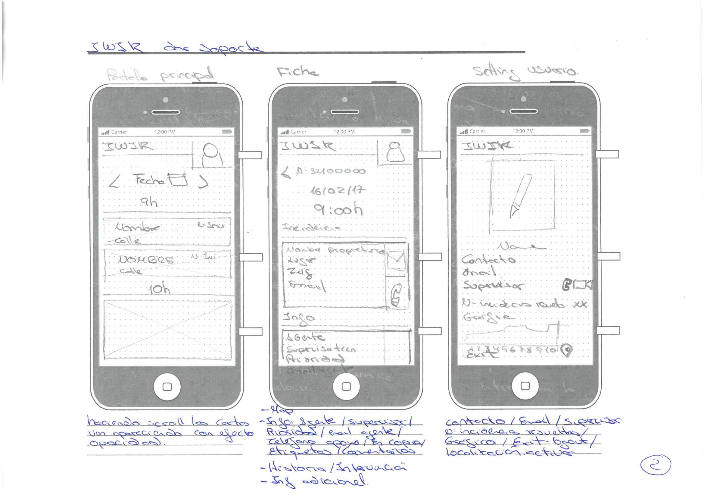

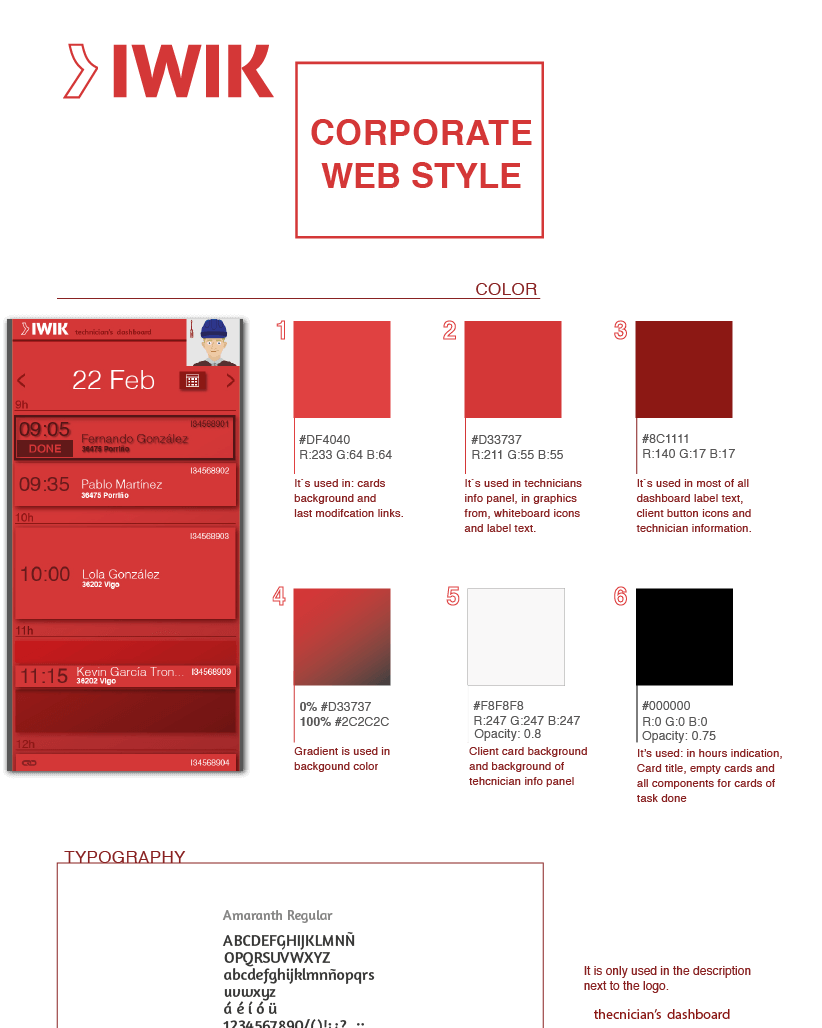
The technician has all the necessary resources to solve any issues at the touch of a button. From the issue details page, they can make a voice or video call to an expert in just one click, thanks to the Sippo’s implementation. It is unnecessary to use another application as Sippo comes all bases. To complete this experience, we have created an infographic to explain the new use case . Now we are combining components in order to be able to experiment and play with the app… To do this a designer created a style guide to help facilitate the development of perfect app.
After using a typography which fits with the values wanted, I focused on its shape to provide dynamism and to highlight the brand. For this, the isologotype, which goes in the lefthand side of the logotype, is a directional arrow to center the user view on the logo.


